Rising Up During Finals Week
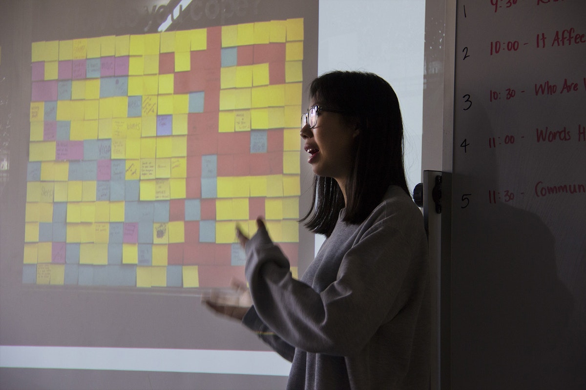
Finals week at Stamps is packed with presentations, as creative minds gather together to share their processes, outcomes, and takeaways.
In Professor Kelly Murdoch-Kitt’s winter 2017 Studio 2D course, five teams of first-year students were charged with creating two-dimensional work that accomplished two primary objectives in this foundational course: 1.) demonstrate skilled exploration of materials and formal visual communications principles 2.) encourages audience participation and gives voice to a value in the campus community.
“Having a larger conceptual goal or theme gives shape to everything you’re learning from a formal perspective,” Professor Murdoch-Kitt reminded her students at the beginning of final presentations. “It gives you a reason and a motivation to put your skills into action.” Students in the course conducted research that led to visual explorations of topics such as sexual assault, racial diversity, microaggressions, and mental health.
For their final Studio 2D project, Stamps first-year students Rebecca Gao, Emily Albright, Sohyun Lim and second-year Stamps minor Casper Kazor teamed up to create an interactive public art installation to remind fellow students to tend to their mental health needs during the stress of finals week. The grid was installed on a window facing the Art & Architecture courtyard for the two final weeks of the semester.
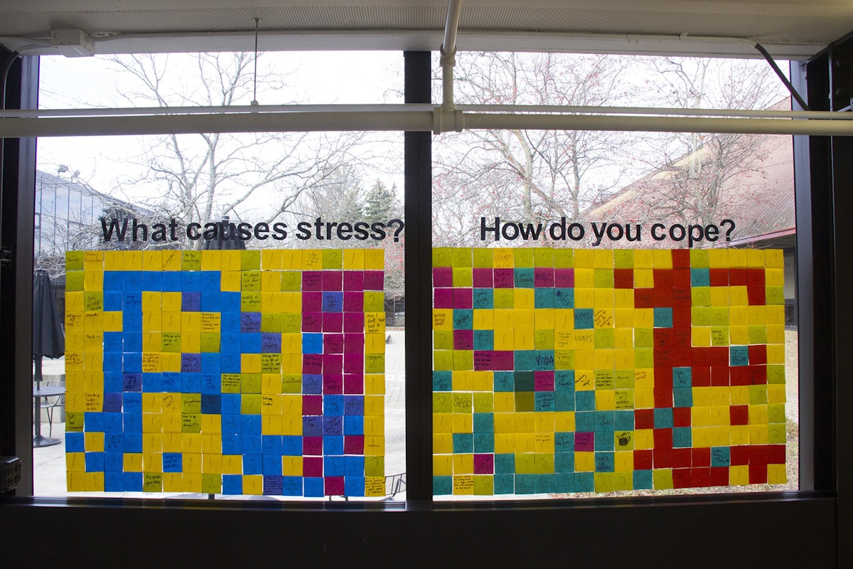
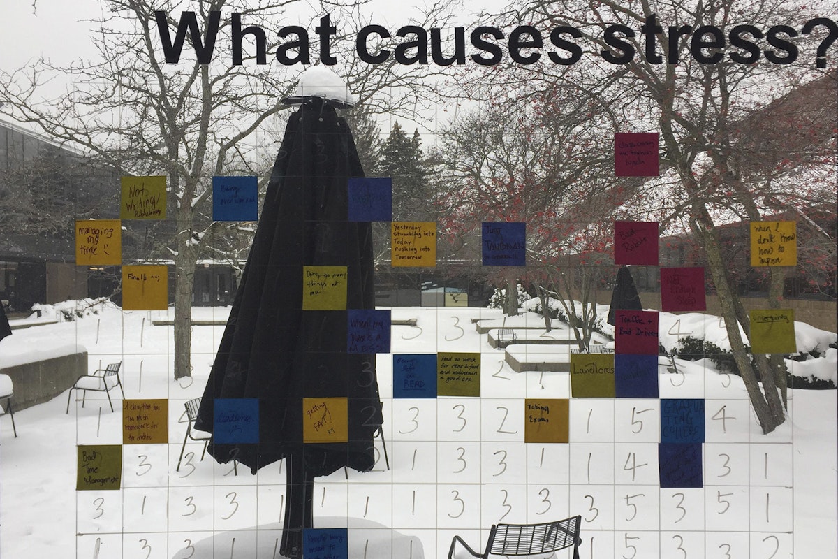
For the installation, the students created two grids — each accompanied by written instructions, colorful Sharpies, and a lively palette of post-it notes, selected specifically to evoke a mood of positivity and proactive support (exploration and use of color was a central component of the project brief). Each space on the grid was marked with a number corresponding to the different post-it colors. The first grid — labeled WHAT CAUSES STRESS? — encouraged viewers to share their stresses by writing them on a post-it note and adhering the note to the grid. The second grid — labeled HOW DO YOU COPE? — encouraged viewers to jot down tactics they use to combat those stressors. Finally, participants would find the matching number on the grid to adhere their post-its.
Once all the post-its were adhered to the window, the two side-by-side grids spelled out the word “RISE” in a bright, graphic treatment. The “RISE” team utilized InDesign and Photoshop to plan their graphic treatment prior to implementation, making an intentional decision to create a slightly pixelated effect, where each element blends slightly into the next to evoke points of connection.
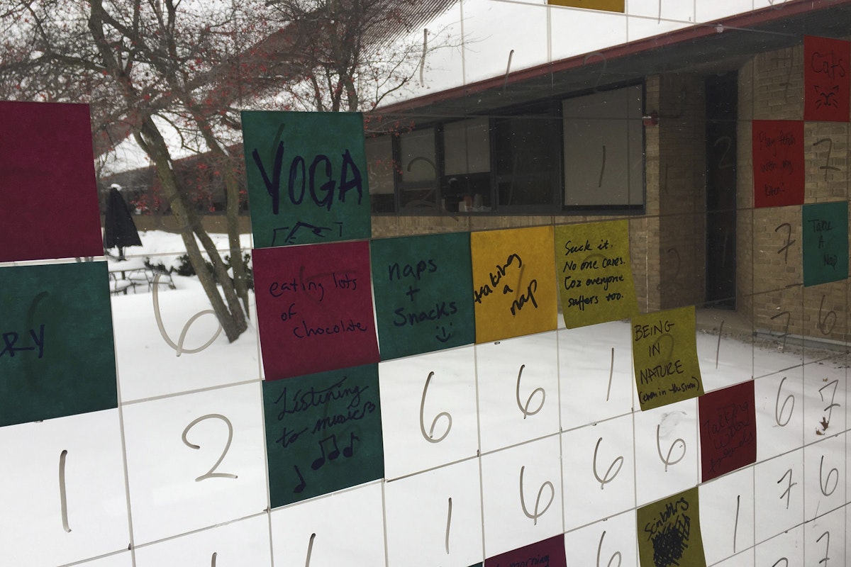
“We wanted to create a conversation around mental health when our community needed it most, learning from one another’s coping mechanisms and building understanding around everyone’s unique challenges,” said Lim.
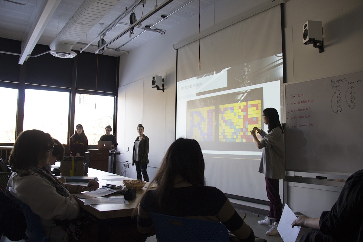
“We wanted to show the cumulative effect of knowing those around you care,” said Gao.
The team also spoke on one of the biggest parallels of the project, the reveal of one’s challenges via post-it notes and the reveal of the word RISE. “There’s a lot of power in the reveal,” said Albright. “As time passes, people realize that there’s a form that’s revealing itself. A network of support has come together to make something really special.”
